


Intro: Mobile Friendly Strategies for your Webpages
by Joshua Van Oosten – Web Developer at Ducktoes Computer Services
It has never been more important to ensure a mobile friendly view of your webpages that is usable on any size screen with the growing number of people surfing the web on smart phones, tablets, TV’s and even car dashboard displays.
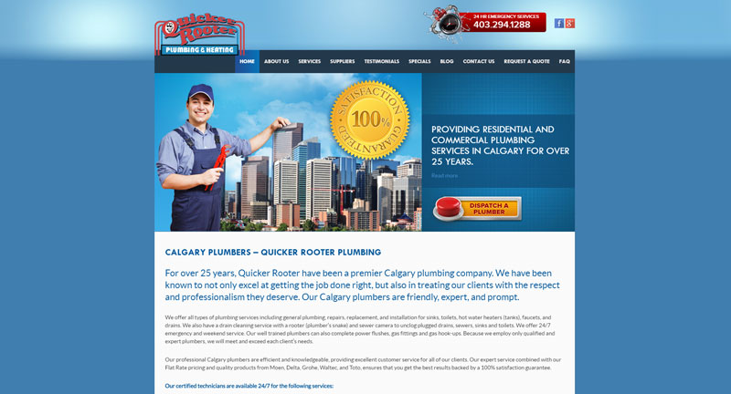
Desktop View |

Tablet View |

Smartphone View |
Here is the Calgary plumbers’ site.
Important for SEO
Being mobile friendly is also important for search engine optimization. Google and other search engines don’t want to send people on smart phones to mobile unfriendly sites. If your site is not mobile friendly it will be less less likely to rank.
Select a Mobile Responsive Theme
If you are building a website using a CMS (Content Management System) like WordPress (or another CMS like Drupal or Joomla!) it’s as easy as looking for the word ‘Responsive’ when selecting a theme.
Mobile Friendly Html/CSS
However, if you have a website that is built using custom HTML (HyperText Markup Language) and/or PHP (PHP Hypertext Preprocessor – yes really) it might be a little more complicated to achieve a mobile friendly view, and often times the ‘themes’ are created by hand using CSS (Cascading Style Sheet). If this is the case with your website, and you would like to learn how to make your website look good no matter what the screen size the user chooses to view it on, then you have come to the right place.
The Viewport Meta Tag
The first, and arguably the most important, thing you will want to do to create a mobile friendly webpage is to include the viewport meta tag in the < head > of your document :
< meta name=”viewport” content=”width=device-width, initial-scale=1.0” >
This meta tag tells the browser to scale the web-page to the size of the viewport (the area in the browser where the web-page is visible.) Keep in mind this does not include the bookmarks bar or the url bar or the browser ‘frame’ usually called browser chrome (not to be confused with the Chrome browser, but this is where google got the name for their browser).
It is recommended to build your website CSS styles for smaller screens first and then build up to larger screens. The reason for this is that the browser loads the HTML and CSS from the top down (hence the Cascade in CSS) so the mobile styles are applied first. This is important because it is possible that a user viewing your page from a smartphone is accessing your website via a slower 3G or EDGE internet connection. Anyone that has ever used these connection types can testify to how painfully slow they can be. So if we are loading the mobile styles first, the perceived load times seem faster and the person viewing your page can start using it much faster than if they first have to load the desktop version, then the tablet version(s) and finally the mobile version.
That being said, if you already have a desktop version and are just looking to scale the page down for mobile, read on.
For the sake of simplicity, we are not targeting older browsers (IE 9 or older versions of Internet Explorer) However, if you would like to accommodate these aging technologies, there are resources for doing so.
Media Queries
This is the bread and butter of mobile responsive styles and they look something like this:
@media only screen and (min-width:400px) {
/*styles for screen sizes no smaller than 400px wide*/
div.content {
width: 100%;
}
}
Essentially what this does is tell the browser to apply the styles declared within the media query ONLY if being displayed on a screen (as opposed to printed from a printer, or read from a screen reader) and only if that screen has a resolution (size) larger than 400 pixels wide.
Conversely you could use:
@media only screen and (max-width: 1920px) {
/*styles for screen sizes no larger than 1920px wide */
div.content {
width: 100%;
}
}
This tells the browser to apply the styles but only if the screen resolution (size) is smaller than 1920 pixels wide.
**It is important to keep in mind that any styles declared before the media query will remain, you do not need to reapply styles that do not need to be changed (like font color for example).
There are other parameters that can be applied, for example you could target:
(max-width:1000px) and (min-width:500px) { … }
Applied only if the resolution is between 1000 pixels and 500 pixels.
Or
(orientation:landscape) { … }
Applied only if the browser viewport width is greater than it’s height.
Relative vs Absolute Values
Images
When creating styles for many different screen sizes it is recommended to use ‘relative’ units (like % or rem) instead of absolute units (like px or pt). For example, images don’t look so good when they grow out of the content on smaller screens or shrink to postage stamp sizes on larger ones, so we would use something like :
img.full-width {
width: 100%;
height: auto;
}
Applying this class to our image tags will guarantee that the image will scale nicely as the screen width changes. The image will always fill the entire width of it’s parent element and maintain it’s aspect ratio.
Content Areas
It is not uncommon for a webpage to have a main content area with a sidebar next to it. In this case I would recommend you use something similar to the following:
#sidebar {
float: left;
width: 25%;
}
#content {
float: right;
width: 75%;
}
When the screen size gets too small to accommodate both sidebar and content areas next to each other you could declare something like the following:
@media only screen and (max-width:500px) {
#sidebar {
float: none;
width: 100%;
}
#content {
float: none;
width: 100%;
}
}
Now when viewing on a screen with a resolution of 500 pixels wide or narrower, the sidebar and the content area will stack above or below each other (depending on the flow of the HTML).
All About Breakpoints
A breakpoint is where our design tends to “break” because the screen resolution (size) gets too big or too small. It is at these breakpoints that we create our media queries.
Ideally you would want to target at least three breakpoints: Desktop:1024px, Tablet:768px and Mobile:425px, but often more are needed.
It’s a good idea to load your page in a browser with a plugin like ‘Window Resizer’ that has many popular screen resolutions pre-loaded that you can choose with the click of a button. But it also provides a handy little display at the bottom of the browser that displays the current viewport and browser width and height (don’t forget the viewport is the browser without the chrome). This allows you to simply resize the browser, watching for when things start looking bad, then create a media query based on that width. Don’t be afraid to create a media query that is used only to change the font size in order to prevent widows (very short lines at the end of a paragraph or column) or orphans (short lines or single word appearing at the top of a page or column), or to prevent your navigational elements from wrapping creating extra space.
Conclusion
This article is by no means an exhaustive guide to creating a mobile responsive web page. I do hope you also take some time to check out the links below to gain a more comprehensive understanding of the technologies and techniques used by professionals to build responsive sites that are compatible with any device/browser combination.
If you need help with your computer or website, Ducktoes.com is your one stop solution. Check out our website for great deals on desktop computers, laptop computers, computer accessories, website redesigns, new websites, SEO, computer and laptop repair, virus or malware removal, and data recovery.
Links:
http://www.w3schools.com/css/css_rwd_viewport.asp – w3schools has a lesson chapter for the viewport meta tag, and is a great place to learn everything there is to know about web technologies. The lessons on the site are written in a way that even the most novice of users can understand.
https://developers.google.com/web/fundamentals/design-and-ui/responsive/fundamentals/ – Let Google teach you how to build a responsive website using best practices that can even help with your Search Ranking.
https://developer.mozilla.org/en-US/docs/Web/CSS/Media_Queries/Using_media_queries – Mozilla Developer Network has a very comprehensive guide on media queries. The guides found here are more technical, but if you’re up for the challenge this site can greatly expand your understanding of building amazing websites.
https://modernizr.com/ – Modernizr is a lightweight bit of javascript you can customize and include on your website to make it easier for you to accomidate older browsers that don’t support newer technologies like media queries
Window Resizr – Download and install this Chrome extension in order to emulate various screen resolutions at the press of a button. It’s perfect for testing your website layouts for a variety devices in different orientations.
Ducktoes Web Design (Calgary Web Design) can make your site mobile responsive. Contact us today for a quote. We also do SEO for Calgary businesses.
6 Responses
Great article it’s also worth considering creating a mobile app for cell phones or smaller devices. Although you need to know how to customize it for SEO performance sometimes its just a better and simpler experience for cell phone users.